
The obvious necessity of a Design System is its “single-source-of-truth” benefit. We started to experience harsh inconsistencies during development, so we tackled it with an improved system.
In the first iteration, when I was still using Sketch, we used to combine the Sketch inspector (which was in beta back then) with Zeplin. That was not an effective way to use the design system at all. So we had to move on after a couple of months.
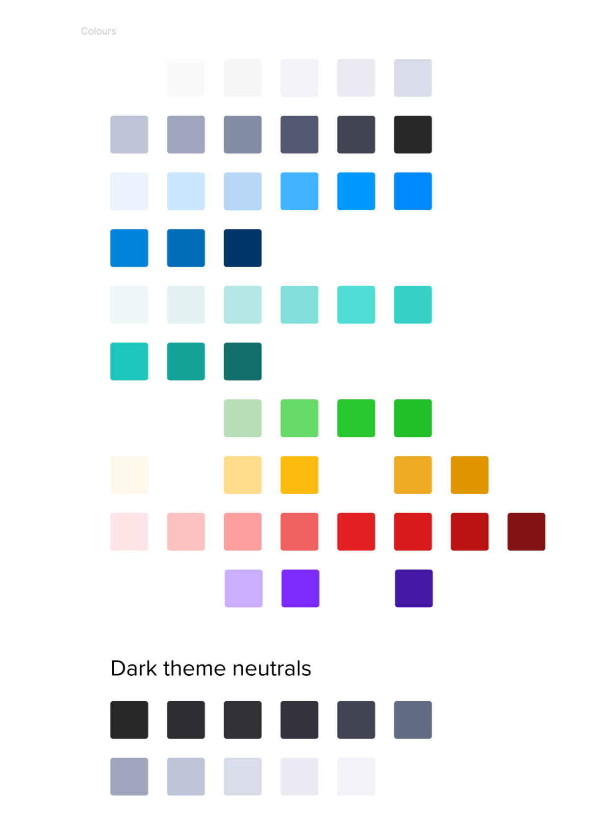
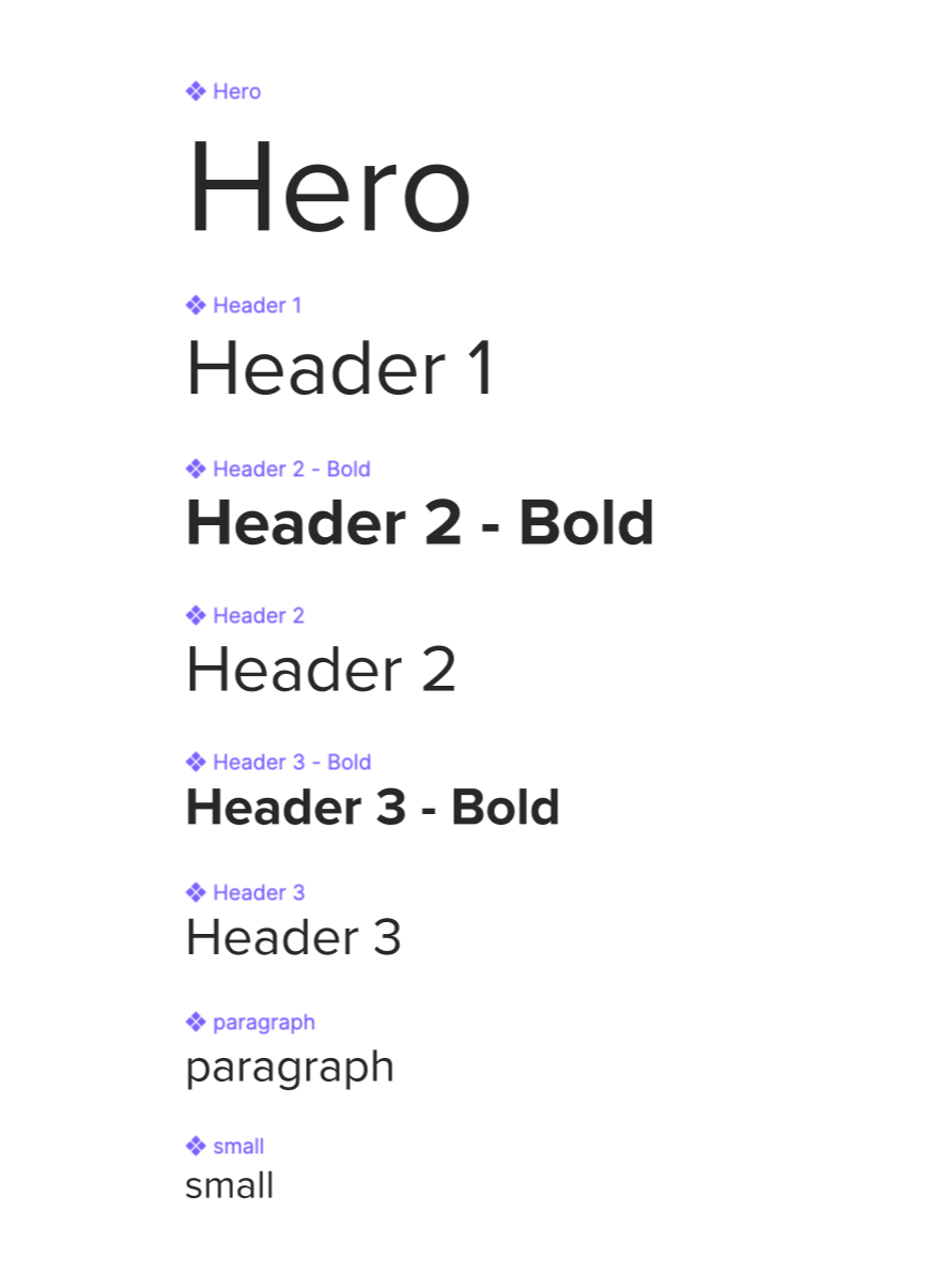
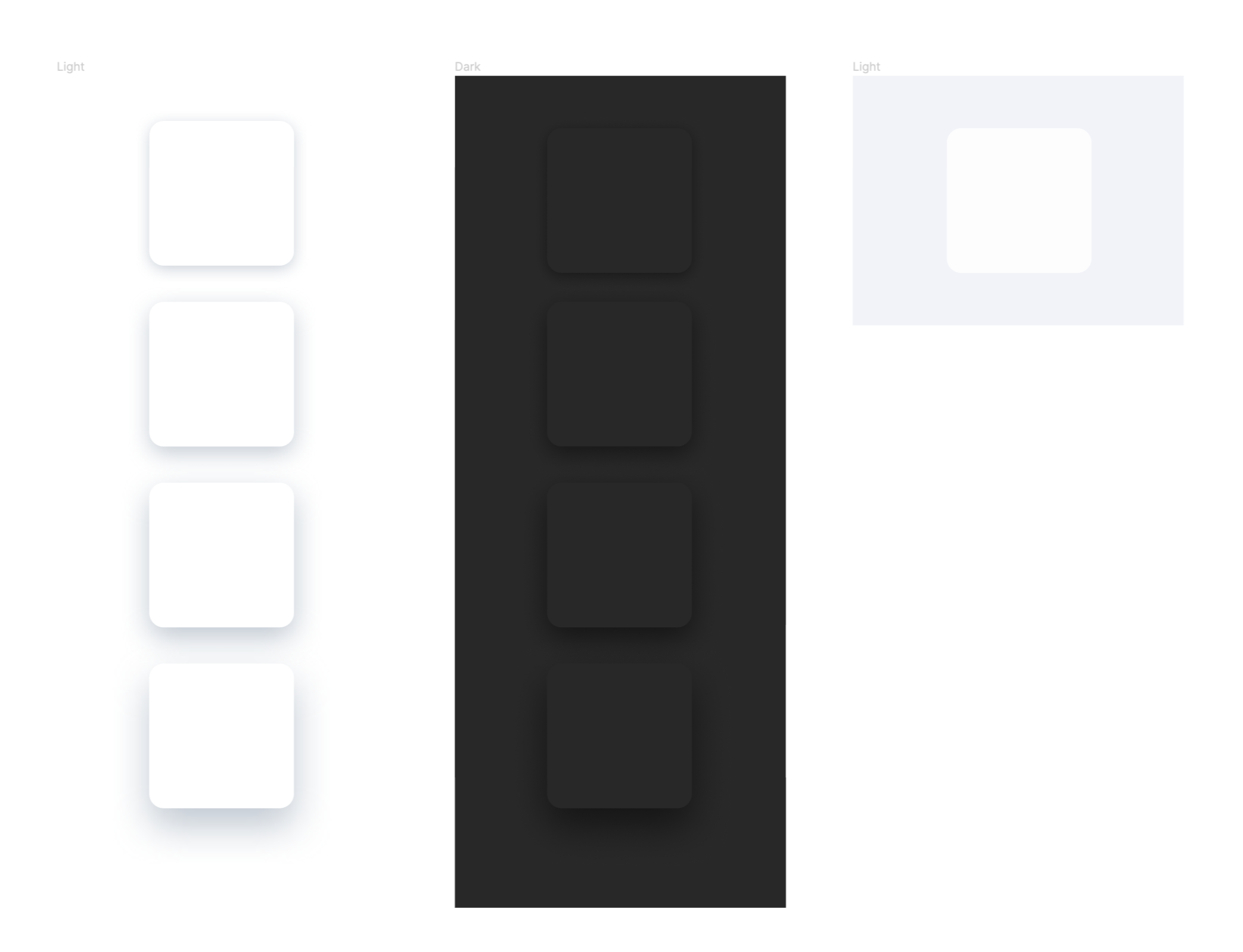
Once I found time to move to Figma, I took the opportunity to start from scratch. Revisited the colour palette, the order of typography, recreating the components. The release of the Auto-Layout feature unlocked the realism and detail I could manage with Figma and the Design System.
Though creating and using the elements within design workflows was very easy, we struggled to maintain the codebase, so we looked even further.
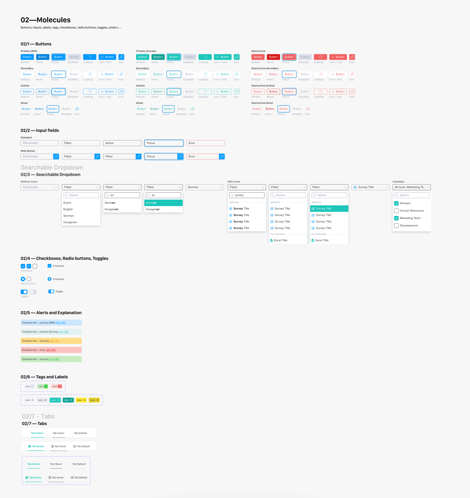
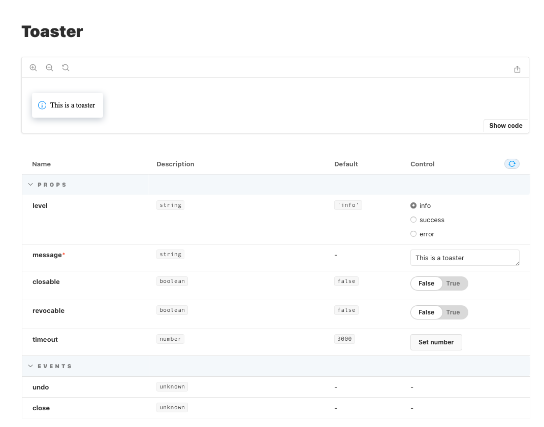
And we’ve arrived at current times. Which is a combination of Figma and Storybook, redid the layout of the Design System file completely and included way more detail when it comes to creating components, keeping slots in mind.
When we got to the Figma + Storybook solution, we knew it would take more time to maintain the Design System but would save a lot of time when it comes to reusing components.
It cleared different cases for buttons, for example. We did manage to solve inconsistencies by replacing design handoffs with a for-developers solution.

I'm a product designer specialising in SaaS web-app solutions. I enjoy working in all parts of a product's cycle and am comfortable taking concepts from a whiteboard to a highly detailed prototype flow, keeping the End-User in mind.
Cheers,
I'm looking forward to working with you!