
Slow loading times appear even slower when using a spinner-like loading design. There is no difference between loading and an error. The loading pattern is handled as a uniform form of loading regardless of context.
Loading charts on the dashboard is done on the user's computer which can't be a foreseen factor on more demanding graphs.
The time spent on a loading animation or pattern should reflect the perceived complexity of a task. In the context of Zurvey.io, generating a dashboard would be a difficult task. In these cases, longer waiting times are appropriate.
However, loading the Home screen should feel snappy and effortless since this is a list view essentially. Most of the loading should happen on the dashboard and not here.
When an expected loading time is longer than 1 second, that's when a loading animation should appear. For really long and complex tasks, there are a few options.

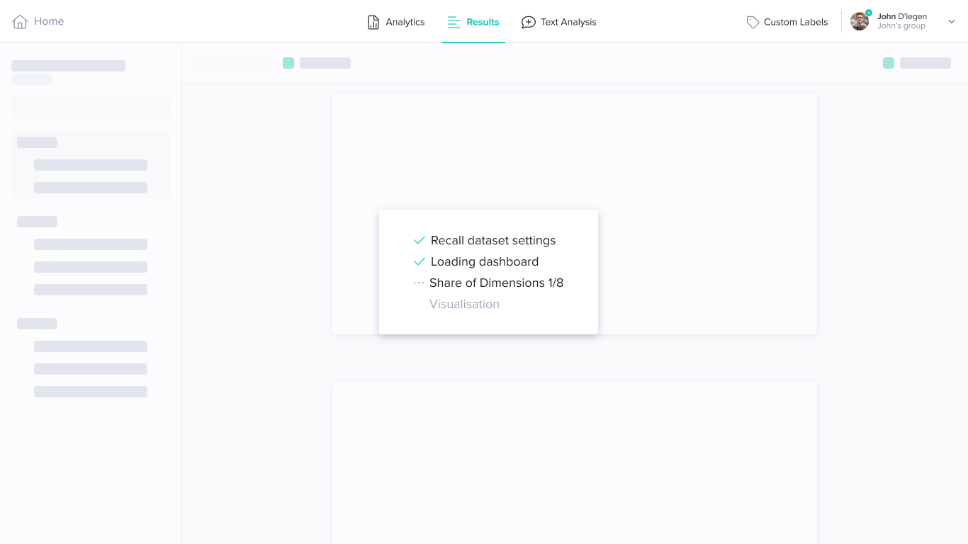
Alternative visualisation for loading is a step in the right direction. However, the actual loading times are more critical. The animations will ease the sense of slow loading times. Though it can look impressive, it is not a be-all and end-all addition to the experience enhancement.

I'm a product designer specialising in SaaS web-app solutions. I enjoy working in all parts of a product's cycle and am comfortable taking concepts from a whiteboard to a highly detailed prototype flow, keeping the End-User in mind.
Cheers,
I'm looking forward to working with you!